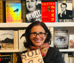
Ms. Jaramillo lives in New York City with her husband, two sons, and two dogs. For more than twenty-five years, she was an art director and graphic designer, designing book jackets for other people’s books while waiting for the right time in her life to start writing her own novels. But a chance encounter several years ago with an extraordinary child in front of an ice cream store made her realize that the right time to write that novel had finally come. Wonder was her first novel (no, she did not design the cover). She has since written several other books in the Wonder-themed universe, including her latest, a graphic novel that she wrote and illustrated titled White Bird. She is currently working on her latest novel, to be published sometime in 2021.
Last year, I worked up the nerve to reach out to Ms. Jaramillo to see if she’d be open to being interviewed about her experience designing the dust jacket for Thomas Pynchon’s 1997 novel Mason & Dixon. After not hearing back from her for nearly a year I’d pretty much lost hope. Then, out of the blue, she responded to my original email, explaining that it had gotten buried in her inbox and she’d just discovered it. Fortunately, she was happy to talk about her Mason & Dixon experience!
Her talent and intuition, and collaboration with Pynchon, resulted in the perfect dust jacket for one of Pynchon’s finest novels. And she’s a lovely person, to boot!
What is your background in design?
I went to the High School of Art & Design in New York City, and then to Parsons School of Design where I graduated with a Bachelor of Fine Arts degree in Illustration. Back then, majoring in Illustration still meant studying fonts and communication design at a foundational level, even though the emphasis, for me, was on drawing and painting.
How did you come to designing book covers?
Right after I graduated, I started doing freelance illustrations for the New York Times book review and The Village Voice. Freelancing back then meant pounding the pavement with my gigantic portfolio and meeting with art directors in magazines and book publishers. I got a few jobs illustrating book covers before realizing that I wasn’t enjoying the freelance life and what I really wanted was to be on the other side of the art directors’ desk. I got a job as an art assistant at Scribner’s, where my job was to assist the art director and the four designers on staff in designing book covers for adult trade books.
What was your role at Henry Holt? What other titles did you work on? General professional background?
I was creative director at Henry Holt from 1989-2006. As the VP and Creative Director of Henry Holt adult trade, I was responsible for all the books published by all its imprints, front list and backlist, for the seventeen years I was there. So, that’s literally thousands of books. Book titles that come to mind: Paul Auster’s Timbuktu, Brooklyn Follies, Book of Illusions; Salman Rushdie’s The Ground Beneath Her Feet; Sue Grafton’s mystery novels; Louise Ehrdrich; Michael Frayn; Colum McCann; Noam Chomsky; Hilary Mantel; Nicholas Basbanes’ A Gentle Madness. It’s been a while so forgive me if I can’t remember more than that. It was a good run!
Then I became Editorial Director and Creative Director of Children’s Books at Workman Publishing (2006-2014) for eight years, during which I wrote and published Wonder, which came out in Feb 2012 and has been on the NYT bestseller list since March 2012 (it was #3 on the list as of mid-October).
Before designing the cover for Mason & Dixon, were you a reader of Pynchon’s fiction, or even aware of him?Of course I was aware of Pynchon but no, I had not read him.
How was the assignment presented to you? Was there a creative specification provided? Could you share any details of the spec?
There was a lot of secrecy around Tom’s book. The editor, Ray Roberts, was very protective of it and few people were privy to the manuscript before it went to copy editing. In fact, there was no “fact sheet” for it at first, so I was only told what the title was verbally, which I heard as “Mason and Dixon.” Thats why my original designs did not involve an ampersand. I was introduced to Tom in my boss’s office. I should mention I was 8 1/2 months pregnant at the time, and Tom was very wonderful about that. His son was, I think he said, about five at the time. We talked about parenting stuff. And his book, of course.
What was your impression of Pynchon when you first met him?
 He reminded me a bit of Shaggy from Scooby-Doo, if Shaggy had white hair. That’s what I remember. And his teeth. He was so easy to talk to. He knew I had just had a baby, and he seemed just as interested in talking about babies as he was about the book jacket. He told me his son was about five years old at the time, and he struck me as somebody who enjoyed being a father very much.
Who came up with the overall concept of the jacket (the ampersand and the only partly visible names on the front cover), and the idea of the double jacket. Was it purely your own idea, or did you get any inputs or directions from Pynchon or his editor?
That was my idea. Tom had conveyed that he wanted the book to be as true to the time period as possible, especially with regard to fonts used. We talked a bit about letterpresses, and I remember he was delighted when I told him my father was a typesetter who had learned the trade very old school, pre Linotype. We talked about the beauty of letters literally pressing into paper fiber.
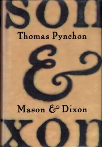
So, I started playing with that idea of fonts, just doing an all-type cover. As I said, at first I thought the title was Mason and Dixon, and when I laid those words out, flush right, I loved the way the last three letters of both names stacked above and below the “and”. I thought, why not just have that be the front cover: son, and, xon? The letterforms were so beautiful in their own, apart from their function as parts of words. This way, people would have to pick up the book to actually read the whole title. Blowing up the type so that it filled the whole cover allowed me to show the paper fiber, the indentation made by letters pressing into fiber, and it looked cool. “son” stacked over “and” stacked over “xon.” As for the acetate overlay, it just made sense to do that.
Now, I have to mention here, that I designed the cover in my living room, as I was on maternity leave. I had my son about two weeks after I met with Tom, and came back to present my comps to Tom about two weeks after I had my son. It was the only cover I worked on while on leave.
When I came back to the office to show Tom the covers, he was so sweet about asking me about how my son was doing, how I was doing. And then I showed him my idea for the cover. I only had one. I knew it was the ONE. Sometimes you just know. Luckily, he loved it. The only problem, he noted, was that he envisioned the title with an ampersand.
So, I redesigned it with an ampersand and sent that to him. But I had used the traditional version of the ampersand, and I got a little note from him with a drawing he made of the other kind, the et form of the ampersand [1]“ampersand” is a term used to refer to the symbol &, which stems from the ligature of the Latin word et, meaning “and.” The term ampersand is derived from “and per … Continue reading, which was his preference. I was so glad because the et ampersand looked so much better than the other version. It filled the space beautifully. Once the right ampersand was in place, the whole thing just locked.
How did your work on the cover relate to the exceptionally elegant, readable typography and page design of the printed pages?
The jacket design was done first, and it’s likely the interior designer picked up the type design and font for the interior from the jacket. Even though they’re two separate departments, the interior designer usually tries to have the interior reflect the exterior. I imagine Tom, who was pleased with the jacket, would’ve pushed to have the interior match it as much as possible.
Did you look at the original Mason & Dixon survey map? Pynchon clearly had a copy.
Probably. Tom showed me a bunch of items when I met him. More than anything he wanted me to convey the sense of a letterpress, of parchment, distressed type.
The way I got the front-jacket type to look like that was I printed it out in 12pt, and then blew it up over and over again on a xerox machine?
Were there any aspects of the project that you considered unusual, or was it pretty straightforward? How would you contrast working on the Mason & Dixon project with other projects you’d worked on?
It was, to this day, the best experience I’ve ever had working on a cover, the only experience I’ve had where my original design, as I envisioned it, was actually used with no changes or complications (other than the ampersand). It’s unusual for a jacket to have that clear a path from designer’s head to publication, but that was the case.
Footnotes
| ↑1 | “ampersand” is a term used to refer to the symbol &, which stems from the ligature of the Latin word et, meaning “and.” The term ampersand is derived from “and per se and.” The symbol has also been used as part of &c in lieu of etc. (et cetera). The aesthetic features of the symbol vary according to the font and variants chosen, although the roman type has prevailed. |
|---|


Terrific anecdotes and creative insights here. Thanks, Tim!
Great stuff, Tim – thanks so much for doing this!
Excellent piece, thank you Tim.
I remembered vaguely that way back in May 1997, a pynchon-l list member contacted Raquel Jaramillo by phone after an article in the New York Observer.
Here’s the message:
When Last We Left Our Friends:
The New York Observer article that was the subject of discussion a couple of days ago (type on the cover scanned out of an old book, Cranky Old Pynchon sending poor cover designer all over Hell’s Half-Acre searching for the right ampersand, TRP finally locating the ampersand juste in a dusty old octavo, etc., etc.) turns out to have been slightly ETAION SHRDLU.
Suspecting this, and possessed by a burning desire to nail down the facts, I picked up the phone and called Henry Holt and spoke with Raquel Jaramillo, the designer of the M&D cover. I was expecting a degree of reticence, perhaps mandated by her employers, but she was very personable and seemed flattered and more than happy to talk about the design and the methods she used. Shop-talk ensued.
The Observer article was accurate about the way she scanned from a 200-year-old book the letters that make up the words “Mason” and “Dixon.” The odd green-and-brown glow that appears around the letters are shadows from the small indentations in the paper caused by the impression of the original letterpress, emphasized “slightly, but not very much” with Photoshop Levels tweaking. They became visible only after the relatively small letters were blown up to many times their original size. The parchment-like background is in fact the actual paper from which the scans were taken, also blown up.
Where the Observer seems to have wandered a bit from its usual ruthless fact-checking standards is in the Tale of the Ampersand. Pynchon is fussy about his ampersands, he did reject a lot of commercial amps, but in the end Raquel drew one in Photoshop that satisfied TRP — according to her, the bit about the “tawny old manuscript” is a load of cobblers. The amp she drew was artificially aged in Photoshop, and she rubber-stamped the green-and-brown “aura” around it from the other letters. (If you look carefully at it you can tell — it doesn’t look quite as organic as the rest.) The type on the acetate and on the inside flaps is Pabst, one of those unholy antiqued computer faces that seem to distress Mr. Siegel so much.
Composition was done in Quark.
And no, I didn’t have the stones to ask Raquel if she’d transfer me to Betty Lew.
Harrison
Thanks Michel! Definitely fills in some blanks and expands details. Raquel is indeed a lovely, smart and down-to-earth woman, really a joy to talk to.
Thank you for sharing this! I interned at Holt in 1999 (just production, nothing worth remembering) and I remember when I’d walk by Raquel’s office, I’d think, “it’s her!” That cover mesmerized me back when TP was just an author I hadn’t got around to reading yet, other than the first page or two of “son&xon” I sampled again and again in the local bookstore. I never had any professional reason to bother her during the day, so this was a delight to read.
Is there a possible connection between the cover of MASON & DIXON and the original cover of the Pelican book on THE ENLIGHTENMENT? Cover picture by Humphrey Sutton ; the book published by Secker and Warburg in 1979. The covers are amazingly similar!!