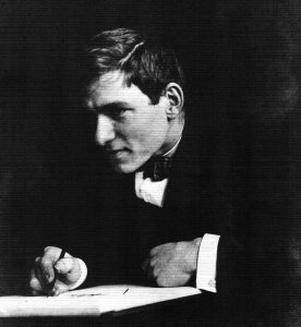
Considered one of the few graphic designers, illustrators, and calligraphers of international reputation, David was a German-born graphic artist who practiced the first third of his professional career in Jerusalem and the remainder in New York City. He is noted for his brilliant work in Hebrew and Latin calligraphy, lettering, and type design, as well as for his distinctive linear style of illustration. David liked to say that the hand is the most marvelous tool if properly trained, and his own handwork supports this conviction. [1]
In order to track down David’s design mockups for V., I first contacted Helen Brandshaft who manages the Ismar David Electronic Archive (IDEA). She directed me to the Cary Collection at Rochester Institute of Technology, which houses Ismar’s “archive,” including artwork and correspondence. As Ms. Brandshaft said: “In those days the artist who did the jacket submitted dummies of the jacket design for the publisher to see and choose from. These are astoundingly exact paintings of the jacket design. The printed jacket was usually made from color separated art. That means the artist specified colors and created black and white images for each color.”
The finding aid for the collection showed that the artwork for V. was in Box 33, folder 578 and included “dust jacket, cover dummies, lettering”. Ms. Brandshaft thought I might see ideas for the cover that were rejected by the publisher.
In our email exchanges Ms. Brandshaft, who worked with Ismar David for many years, commented: “Ismar did tell me that the jacket was considered pretty radical for its time. It certainly is unusual in terms of his style.”
This is quite true. Most all of Ismar David’s designs for books (and in other contexts), with the exception of V., utilize elements reminiscent of Hebrew texts and calligraphy, with stark line-sketch illustrations.
Pynchon’s Concept for the V. dust jacket cover
From the collection of correspondence between Pynchon and his editor of V. Corlies “Cork” Smith, we find only one reference to the design of the V. dust jacket:
February, 1962, Smith asks: “Have you, by the way, any jacket ideas?” On March 13, 1962, Pynchon replies: “The only jacket idea I have is a nice four color reproduction of di Chirico’s Enigma of the Hour. But I suppose that is Not Done.”
On March 20, 1962, Smith replies: “I will look into the diChirico business and let you know. Sure it’s done.”
On October 1, 1962, Pynchon writes to Faith Sale, a longtime friend who took over the editing of V. when Smith moved over to Viking, expressing his distaste for the V. cover. Lacking the letter from Faith to which he’s apparently responding, it’s a bit murky as to which design he might have been reacting, but he writes: “Ahhrrgghh. I was afraid something like that had happened with the jacket. Next time (if there is a next time) I will (D.V.) design my own.” (Thanks to Albert Rolls for providing this letter.)
De Chirico is mentioned twice in V. [Although Pynchon misspells his name as “di Chirico” both times]: on page 295, end of chapter 10: “Paola, whom he had been trying to avoid, pinned him between the black fireplace and a print of di Chirico’s street.” And on page 299 (early in chapter 11): [Fausto’s critical essay on] “di Chirico’s novel Hebdomeros”
Ismar David’s Design Mockups
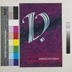
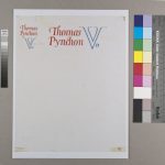
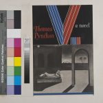
With little direction to go on save Pynchon’s affection for “Enigma of the Hour,” David created the four design mockups below, provided by the RIT Cary Graphic Arts Collection. Of course, there may have been more but below is what survives. Note that Pynchon’s de Chirico “concept” was attempted (although David incorporates de Chirico’s “The Soothsayer’s Recompense” instead of “Enigma of the Hour”).
What I find interesting is the path from designs that are more in line with David’s “typical” work to a final design that is quite different from other work in his canon.
Although we can see some design elements of what became the final version of the jacket — the parallel lines in the de Chirico mockup, the be-serif’d “V” in the mostly empty mockup — the final version really resembles none of the four mockups, neither in color, design nor typography. (Although the “Moebius Strip” “V” in those two curvy mockups is pretty cool.)
One can imagine Pynchon, perhaps with input from his editor Faith Sale, grabbing the reins and pulling the design in a distinctly more modern direction… less ornate, more minimal and stark; fewer curves, more straight lines. The final design strongly telegraphs “This is a MODERN novel!”
The final design for V. (kindly provided by Ms. Brandshaft):
Feel free to comment below.


I wonder if there’s any chance dates for the designs, or at least the final one, or an sequence can be determined. That could be helpful.
RIT Cary dated the designs 1963 but that’s all. As for chronology, no help there. I arranged them in what I imagined the chronology might look like, but really they might be in any order, although I suspect the one with the de Chirico painting might be late in the game as it contains the most elements of the final design. Also, the one with just typography might be later as the “V.” is close to how it was finally rendered. I’m sure there were more mockups to arrive at the final design but I’m afraid they’re lost to History…
You see P expresses misgivings about the dust jacket design in a letter dated October 1, 1962. The assumption is that he disliked the dust jacket we all know. Maybe Faith had written about one of these earlier designs? Faith’s letter that P is responding to isn’t extant.
I don’t have that Oct 1, 1962 letter. Send it to me and I’ll update the post with the new info. Thanks Albert.