A new Pynchon resource helps you keep track of Inherent Vice’s 130 characters, 37 entities, 6 gangs, 4 bands, and 1 dog. The website features color-coded diagrams, plot summaries and other resources so you can get the most out of reading Pynchon’s complex detective novel. Inherent Vice Diagrammed creator Paul Razzell explains the origins and development of this innovative resource.
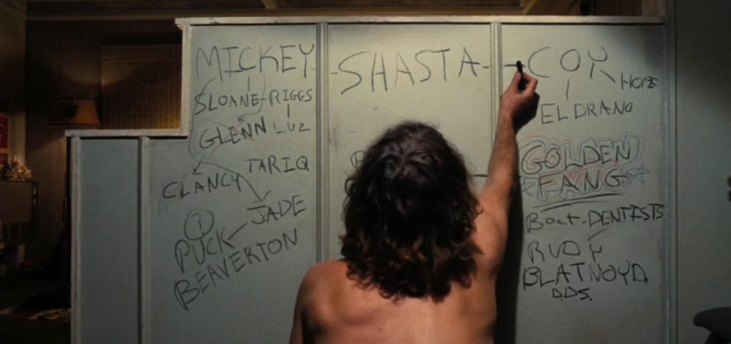
THERE’S A TELLING IMAGE in the film adaptation of Inherent Vice where private eye Doc Sportello attempts to diagram the connections among 16 people involved in his intersecting cases. Using crayons, he writes characters’ names on his living room wall then draws lines between the names to show relationship, connection … or something. Why is this a telling image?
For starters, it reminds you that Doc is trying to do exactly what you’re trying to do: see the relationships among so many characters and what those relationships can tell us about their motivations, loyalties, hostilities, and power dynamics.
Second, the scene is the filmmaker’s acknowledgement to viewers that keeping track of all these characters and their relationships is hard work. Even a seasoned private eye like Doc, who’s had personal contact with most characters, needs a visual aid. (Doc’s diagram shows 16 characters only. There are over 50 in the film. His wall is nowhere near big enough to accommodate so many names at once nor, you are led to believe, is his mind.)
Third, the image reveals a cognitive flaw in Doc’s diagrammatic approach: all of his lines are unlabeled. How is Glen related to Clancy? How is Coy related to El Drano? Doc’s highly generalized crazy wall doesn’t answer such questions. It carries no precise or informative meaning that would lead him—or us—from confusion to revelation.
Inherent Vice Diagrammed brings you much closer to that revelation. This free resource helps you see through Doc’s marijuana haze with
- elegant diagrams showing character-relationships
- concise chapter summaries
- plot summaries
- an index revealing each character’s relationships.
Reading Inherent Vice is, after all, detective work. It’s about finding connections between many people, organizations, and entities with a view to solving crimes and, perhaps, seeing where America is headed.
Why diagram Inherent Vice?
While movie-goers grapple with keeping track of the film’s 50 characters, readers grapple with keeping track of the novel’s 130. My first reading of Inherent Vice left me with questions like, “Who was character x?” and “How was character y related to character z?” Not being able to recall or account for some characters left me feeling frustrated that I didn’t have the full picture. I knew that the process of examining the relationships more deeply would help me understand characters’ motivations, follow the money, and see power structures.
I saw an opportunity to use information design strategies to communicate the novel’s wonderful complexity to others. Those strategies include:
- Reveal complexity (instead of concealing it)
- Label relationship arrows to give them informative and precise meanings
- Permit only vertical and horizontal lines (and use a grid) to prevent the diagrams from seeming chaotic
- Use color meaningfully to reveal something important (in this case, the novel’s main power dynamic)
- Use clean typography
- Prohibit chartjunk
- Aim for elegant solutions
Of course, maintaining a comprehensive mental inventory of every Inherent Vice character isn’t necessary to enjoying Pynchon’s marvellous entertainment, but visually organizing their relationships helped me understand Doc’s predicament and his paranoia that everything is connected. My feeling was that if my diagrams could help me get more out of the book, they could help others. And so began Inherent Vice Diagrammed.
Learning from other examples

Diagrams helping readers of fiction are not new. Think of Tolkien’s Map of the Middle Earth that accompanies The Lord of the Rings: it helps you keep track of the places as characters journey through these imaginary lands. Kurt Vonnegut’s Shapes of Stories diagrams are deservedly well-known. Others visualizations are less successful. Sam Potts’ diagram of Infinite Jest says nothing about the novel other than its characters have many interrelationships. This diagram lacks labels and organization that would make it meaningful to readers. JK Rowling Analyzed is a triumph of form over function: to see and compare the data points, the chart compels your eyes to travel backward and forward along winding colored lines that are packed too tightly to follow without losing the thread. Numerous discrete charts would have been a better information-design solution than one dazzling mega-chart.
I also attempted drawing a mega-chart inspired by Mark Lombardi’s beautiful conspiracy theory diagrams. My initial plan was to publish a single poster-sized image that revealed every Inherent Vice character relationship at once. This was a misstep that cost me a month of fruitless drawing. As I discovered, this approach has four flaws:
- Large posters are too cumbersome for most readers to use while reading.
- Posters cannot be freely and easily accessed by readers.
- A diagram showing all relationships among the 130 characters would present readers with a bewildering amount of information at once.
- Finally, Lombardi does not label the lines connecting his nodes. He reveals that character x is connected to character y but doesn’t identify what that relationship is. In this way, Lombardi’s beautiful diagrams are as flawed as movie-Doc’s crazy wall.
The solution to the first two problems was to build a website offering diagrams as embedded image files and downloadable PDFs. I solved the third problem by making a character-relationship diagram for each of the novel’s 21 chapters, so you have a relevant, spoiler-free reference at every step along the way. And by adding a meaningful label to every relationship line, I could overcome the cognitive flaw in Lombardi’s example. I was on my way.
Drawing, more drawing…
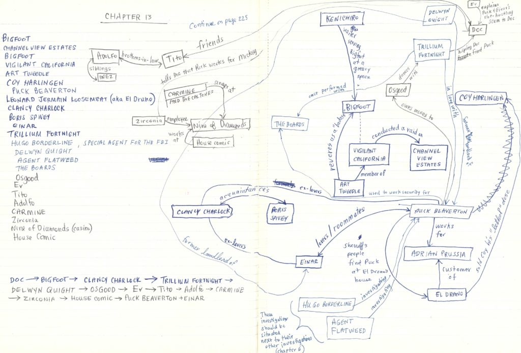
Reading the book while simultaneously drawing the preliminary diagrams was easy. Every time Pynchon referred to a character, I’d write their name in a notebook and draw labelled lines showing their connections to other characters. Preliminary diagrams looked like this (this is Chapter 13 in its earliest form):
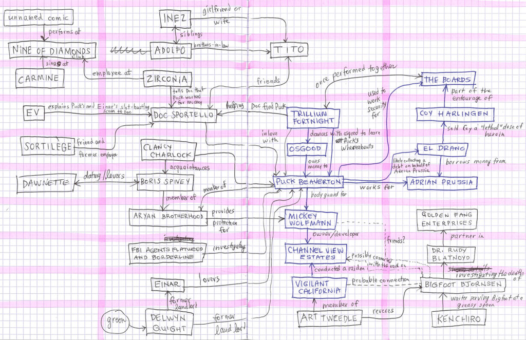
The hard part was disentangling those crossed relationship lines, and doing so occupied all of my spare time over the next several months. This process required me to draw each chapter’s diagram as many as eight times to tease out tangles and create a sense of order and organization. The next step was to plot the diagrams on a simple grid that would accommodate the final version of the diagram on the website. Here’s chapter 13 once again:
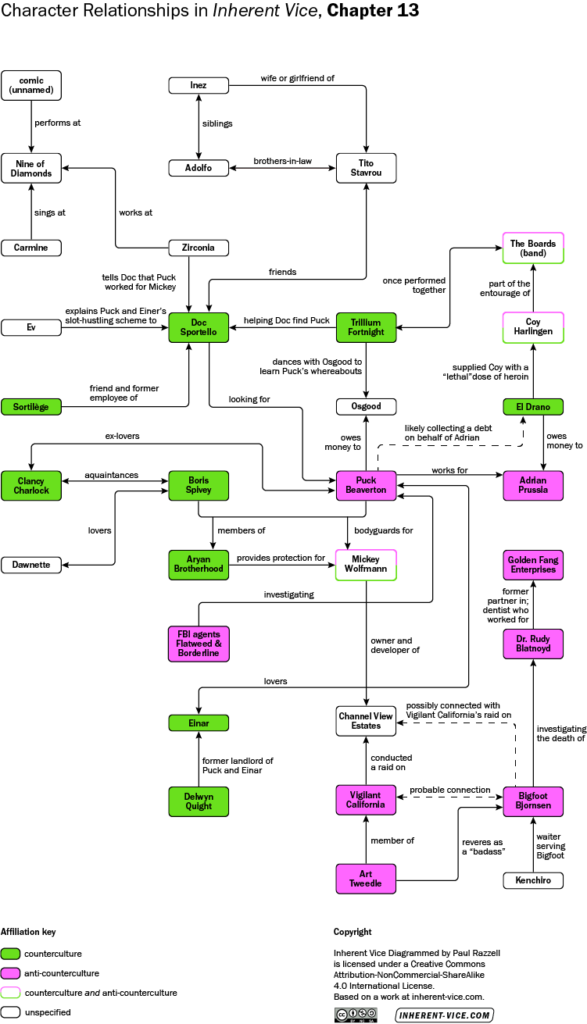
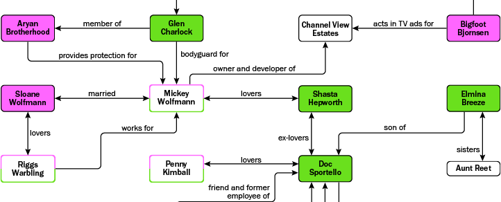
The grid (the bold pink lines in this example) was essential for creating a sense of organization and order for readers. Without it, readers would be presented with a forbidding array of data that would be difficult or impossible to use. At this point, I left my hand-drawn diagrams behind, and rendered the images in Adobe Illustrator. Here you can see the Chapter 13 diagram transformed into the published image. Notice how the grid organizes the data into tidy columns and rows:
Display and design notes
Desktop versus mobile
Inherent Vice Diagrammed offers micro and macro readings simultaneously but only when viewed on a desktop computer. When viewed on a mobile device, details are legible only if you pinch-and-zoom, but then you lose sight of the vast network of connections. The small window on your mobile device, therefore, conceals the big picture rather than reveals it, and this works against the purpose of the diagrams and, indeed, of the site itself. Plot and chapter summaries can be comfortably read on mobile.
Getting the right line weight
The weight (thickness) of the relationship lines and the frames around the names match the thickness of the weight of the font used for characters’ names. This may seem a minor detail, but the overall effect contributes to the tidiness of the images.
Rounding corners
Hard, sharp, right angles and corners are visually stronger than their rounded counterparts. In my diagrams, the corners of the nodes and the joints of arrows aren’t features that require attention, so I rounded them to soften and de-emphasize them.
Avoiding crossed lines
It can be difficult for your eye to follow a line or arc when it crosses another at a shallow angle. While I avoided crossed lines with great care and perseverance, in a few cases crossings were unavoidable. To get around this problem, I used only two kinds of lines in my diagrams: vertical and horizontal. Their intersection (a right angle) is as visually unambiguous as two intersecting lines can be.
Color-coding the novel’s power dynamic
It was also essential that the diagrams should offer important commentary on the principle power dynamic in the novel: the incessant interplay between the counterculture and the anti-counterculture—and enigmatic cases where characters are affiliated with both. Discovering this dynamic was one of my many aha! moments in this project. In my diagrams, these affiliations are represented in the “psychedelic favorites, green and magenta”—the very colors used in the sign above Doc’s office door.
Proofreading and making the index
Once the artwork was complete, I ensured all names, relationships, and affiliations had been recorded consistently across all 21 diagrams. Discrepancies such as this one had to be resolved:
Bigfoot Bjornsen detective with LAPD (chapter 1 diagram)
Bigfoot Bjornsen member of LAPD (chapter 5 diagram)
The only way to do this was to copy every relationship from the diagrams into a spreadsheet, sort them alphabetically, then proofread line-by-line for consistency. (There were 1,300 lines.) The tediousness of this task was something even my obsessive Pynchonophilia had a hard time getting me through. The process of proofing the data then correcting the Adobe Illustrator images took several weeks.
Seeing all names and relationships lined up in the spreadsheet gave me the idea of offering readers an index showing how each Inherent Vice character or organization is related to other characters and organizations in the novel. This tool will be of most use to students and researchers. For now this will be available as a downloadable PDF only.
While reading and drawing diagrams, I also wrote concise chapter summaries to deepen my understanding—and memory—of the action. Those, too, I knew would be useful for readers, and became a key part of the website.
Feedback from readers
Readers consistently point to the site’s usefulness and its beauty. One of the most common questions I get in response to Inherent Vice Diagrammed is, “Which Pynchon novel will you diagram next?” I take this as a sign that my initial foray into diagramming fiction has been a success. It’s been gratifying to hear that readers are finding Inherent Vice Diagrammed useful just as it’s been gratifying to be introduced into the community scholars, fans, and others who love and obsess over Pynchon’s novels. It’s good to do so in their company.
Three unanswered questions
Although my project is done, and my dog-eared copy of Inherent Vice recedes on my bookshelf behind more recent reads, three questions nag me that have nagged me since I began Inherent Vice Diagrammed: how did Pynchon keep all of these characters and their relationships straight in his head as he wrote the novel? Did he make diagrams? If so, what do they look like?
Paul Razzell
Victoria, B.C., Canada
August, 2019
Thank you so much. I’ve been obsessed with this novel forever. Love the tone and texture, but couldn’t make any sense of it. Your diagrams are a perfect complement, right down to the color choices (and the line weights…and the corner radii). Much like the novel, staring at them burns a hole in my brain (in a good way).
Hey Andy,
Thanks so much for your feedback. I’m glad you found Inherent Vice Diagrammed “a perfect complement” to reading the novel. That’s exactly what I intended it to be!
Keep calm and Pynch-on!
Paul